 This is the first possible front cover for my magazine. Just like the kerrang magazine that I deconstructed I wanted to have the title as a banner across the top of the front cover. I think having a banner across the top lets the reader know immediately what the magazine is called. If I was to have the title across the top like this then the red of my title will stand out really nicely, attracting the reader to my magazine. I think only having one main picture on the magazine front cover really draws the reader in. Like the Q magazine the front cover only has one picture on the front cover with sub headings around the picture. This is really effective and I may use it on my magazine front cover. Having the sub titles around the picture and on the picture in some cases is a way of attracting the reader to the magazine. Also because there are a lot of sub titles on the front cover this means to the reader that there may be that the magazine has a lot tot offer and a lot in the magazine.
  My second choice for a magazine front cover layout is to have the title in the top left hand corner like the Q magazine. I think that having the title in the top corner is really good as it is the first thing the reader will look at. The main picture will run from the top page to about ¾ down the page. This is really good as this is a big space for the picture to sit in giving me a lot of choice with what type of shot I want the picture to be. I will also have another picture on the front cover this will draw the reader in as there is more on the front cover which will give the reader the idea that the magazine has a lot of information in. The sub headings around the two pictures will also give the reader the idea that there is a lot going on in the magazine.
I have decided to go with my first choice for the front cover lay out. The title is one of the main aspects of the front cover that draws the reader in, and that is why I think it should be the main thing on the front cover. The picture occupies a large space and this will give me a large choice when I am deciding what shot I am going to use for the main picture.
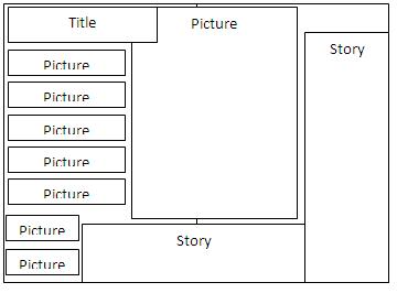
After I decided on the layout for the front cover I thought of possible ideas for the layout of my magazines double page spread. The first layout that I looked at was this one. I like this one as it has a lot going on, on the page and I think that my target audience will like it and have the idea what there is a lot going on. The main picture will take up a lot of the room as I think a lot of people will see the picture and be attracted to the pages. Having the pictures down the left hand side will make the page more attractive and more fun. I really like this as there is a lot going on and the page and I think that it is different from what you normally find on a double page spread which gives the magazine a uniqueness.

The second option of double page spread is this one. I like this one as it is very interesting and I think this one will attract the reader’s attention. The way that the story is all one side I think is really appealing because it is so attention-grabbing and the way that pictures are set upon pictures is different that it is interesting. I do think this double page spread option but I like the other option more as I think that it will be easier to design and I think that it is also more affective.

After the double page spread I started to think about the design options for my contents page. The first one is this option; I think that this is a possible option as the contents page as this is a nice plain layout that I think will suit the style of my magazine. The contents page will have a picture of the front cover on. This will help the reader to remind them of important features in this magazine issue from looking at the sub headings of the front cover. The contents page will have the same colour scheme as the front cover and the rest of the magazine. This will help to like the magazine together as a whole.

This is the second option of possible contents pages, This contents page will have a the page numbers and information about the page down the left and right side. The pictures will be down the middle attracting the reader’s attention to the page. Having the picture of the front cover on the contents page option two I think is a really good idea as well as it reminds the reader what was on the front cover. I really like this design of contents page, and I am going to use it for my final magazine contents page layout. I really like it because of the way in which the contents page is a bit different and has a interesting way of displaying the information the contents page.
No comments:
Post a Comment