In what ways does your media product use, develop or challenge forms and conventions of real media products?
 The things that I found on the front cover of the magazines that I looked at were that the title was one of the few things that stood out when I looked at the front cover. This is why I used a bold and interesting font for the title. One of the other things that I noticed was that the main image would be of a band/artist that was featured later on in the magazine. I used this information by having a picture of a famous ‘artist’ on the front cover and then later on in the magazine there would be an article on them. Also I found out that the main image on the page should take up over tow quarters of the page. This shows the audience that the artist/band are this issues of the magazines main selling point. Another point that I found out was that the main image of the front cover, covers the title a little bit, this also shows that the image is of the main selling point of the magazine. I did not used this idea on my magazine as I thought that it not look very good on my magazine as the colours clashed and also it lest the audience that are not familiar with the magazines name see the whole title.
  This is my final design of my magazines front cover, I used the ideas that I gained from the deconstruction to help me deconstruct that front cover. I think if I was to do this again I would cover a bit of the title with my main image as I think that this gives a professional look to the magazine. I also think that as a result of the image covering the title the image would then be bigger and then the image would have a bigger impact on the audience.
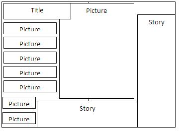
Then for my contents page I also used the deconstructions that I did to help me to make my contents page. The ideas that I got from deconstructions were that the magazines contents page all stuck to the same colour scheme that they used for their front covers. This is why I used black and red like on the front cover I think that it is really important to use the same colour scheme the whole way through the magazine as then the magazine has a professional look and the magazine then links all together as it all looks alike but not the same. Then next idea that I got from the deconstructions was the way in which some magazines layout their contents pages by having a list format. I also used this format as I think it is a really good and useful way of presenting the information. This is because the information is clear and eye catching. I really like my contents page as I think that the layout is very professional.

Then for my double page spread I also used the layouts that I saw when I deconstructed magazines. The main idea that I got from my deconstructions was that the main image should take up about half of the page. This is why I have the picture as the whole page with the block with writing in on top of the picture. Another thing that I noticed was that the magazines used the same colour scheme through out the magazine and on some on the double page spreads. This why I have used the colours black and red on my double page spread. I think if I was to do this again I would have my writing in a more creative bock as I think that I looks a little boring and there for not eye catching to get my target audience attention. 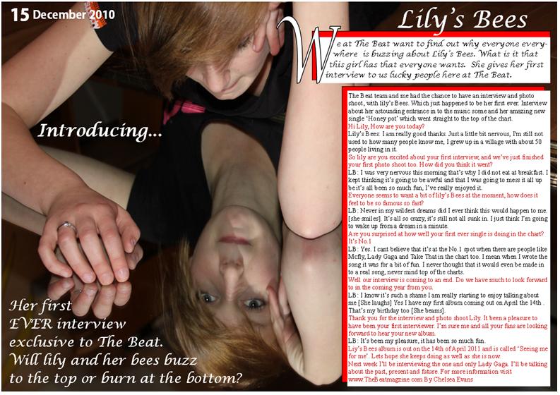
 How does your media product represent particular social groups?
My media magazine target audience is young people aged 16-21. I think that it is important in a music magazine that the audience do not feel as though they should not be reading the magazine. This is why I have used a less formal format when writing though out the magazine with some slang language so that the audience feel comfortable with the magazine. Thought out the double page spread my target audience are represented by a teenage female ‘artist’ who is very popular in the music world at them moment. She represents my target audience as a person who is very passionate about music and admires her fellow musical bands and artists.

I think that my magazine would be published Bauer Media group. This is because this publishing company publishers music magazines like Q and Kerrang! I believe that my magazine has some similarities with the Q magazine, such as the target audience and the use of colour and the genre of music that the magazine features in their magazine.
Who would be the audience for your media project?
My target audience for my music magazine would be young people aged 16-21, these young people would be interested in the chart music or contemporary music. I chose to do this target audience as I am one of them and it was easy to find people who are in this target group. I think that the colours scheme that I used is suitable for my target audience as the colours are eye catching which will attract this age group. The images that I used I think are suitable for my target audience as they are interesting and different (double page spread). I think that this is important as this will attract my target audience. Also the information that I have included I think is suitable for my target audience this is because I have not included any thing too complicated or used any formal langue this is import as my target will feel comfortable reading the magazine.
How did you attract/ address your audience?
I attracted my target audience by using the famous musical acts names on the front cover, I did this because this is one of the ideas that I got from deconstructing current and popular music magazines. I also used the colour scheme to attract the audience’s attention by having the red, black and white which all work really well together. Another way in which I attracted the audience was by having a large image on the front cover, this is one of the ideas that I got from deconstructing some music magazines. I addressed my target audience by using langue that my target audience will understand and feel comfortable with. I also addressed my target audience by including musical acts in my magazine that they will know and like. I showed my target audience my final front cover, contents’ page and double page spread to see how they thought I had attracted and addressed my audience.
I attracted my target audience by using the famous musical acts names on the front cover, I did this because this is one of the ideas that I got from deconstructing current and popular music magazines. I also used the colour scheme to attract the audience’s attention by having the red, black and white which all work really well together. Another way in which I attracted the audience was by having a large image on the front cover, this is one of the ideas that I got from deconstructing some music magazines. I addressed my target audience by using langue that my target audience will understand and feel comfortable with. I also addressed my target audience by including musical acts in my magazine that they will know and like. I showed my target audience my final front cover, contents’ page and double page spread to see how they thought I had attracted and addressed my audience.

“I really like the picture on the cover; it was the first thing that I looked at. It’s cool”
“I really like the way in which Chelsea has used the black, white and red through out her magazine; it really links all the magazine together”.
“I found the magazine really easy to read, it did not have any complicated words and it really suited me. I love it, I want to buy it”.

“I think a good way that I was attracted to Chelsea’s the magazine was that it looked like a real music magazine and she had some really famous names on the front cover just like some real magazine have”.
The first thing that I did in my project was to look at and to deconstruct popular music magazines. I did this to help me get ideas of things that I should and should not include in my music magazine.
What have you learnt about technologies from the process of constructing this product?
I used photoshot and publisher when creating my front cover, contents page and my double page spread. I have learnt how to crop, and cut parts of the picture out. I have learnt how to get rid back grounds on my images. This is really useful as the backgrounds that I shot my photos on had shadows and different shades of the colour. We had to present all of the coursework on bloger.com so I had to learn how to upload my text, pictures and videos. I found the programme hard to use a first but quickly learnt how to use all of the buttons.
I used photoshot and publisher when creating my front cover, contents page and my double page spread. I have learnt how to crop, and cut parts of the picture out. I have learnt how to get rid back grounds on my images. This is really useful as the backgrounds that I shot my photos on had shadows and different shades of the colour. We had to present all of the coursework on bloger.com so I had to learn how to upload my text, pictures and videos. I found the programme hard to use a first but quickly learnt how to use all of the buttons.


Looking back at your preliminary task, what do you feel you have learnt in the progression from it to the full product?
I think that I have learnt a lot of things about how to construct a music magazine. I now know what thing I should and should not include in a music magazine I know what important features should stand out. In my preliminary task I don’t think that my front cover was eye catching enough and it looked at bit boring. This is why in my final front cover my title was in a black box, by doing this I made the title stand out much more. It is important that the title stands out as it is one of the first things that the audience look at. Another thing that I have learnt is that using white on a light background is a bad idea. The sub headings that I wrote in white on my preliminary task did not stand out enough on the light back ground. This is why for my final front cover I decided to have a white back ground like Q magazine sometimes have. The white background made the subheadings stand out a lot more. I also changed the colours of my subheadings from white and back to red and black. I think this was a good decision as the subheadings stand out so much more now. I feel like I have learnt a lot from my preliminary task to my final design especially on my contents page, the title (Contents) is in a black box just like the title on the front cover, this helps to liken the magazine together, I got this idea from magazines such as Kerrang! And Q, they have the title of their magazine and the title of the contents page in the same format. I have also added pictures to my contents page and related them to what page is picture is from, I did this because I saw when I deconstructed popular magazine that doing this was the norm and really help the audience when trying to find what page the image is from.